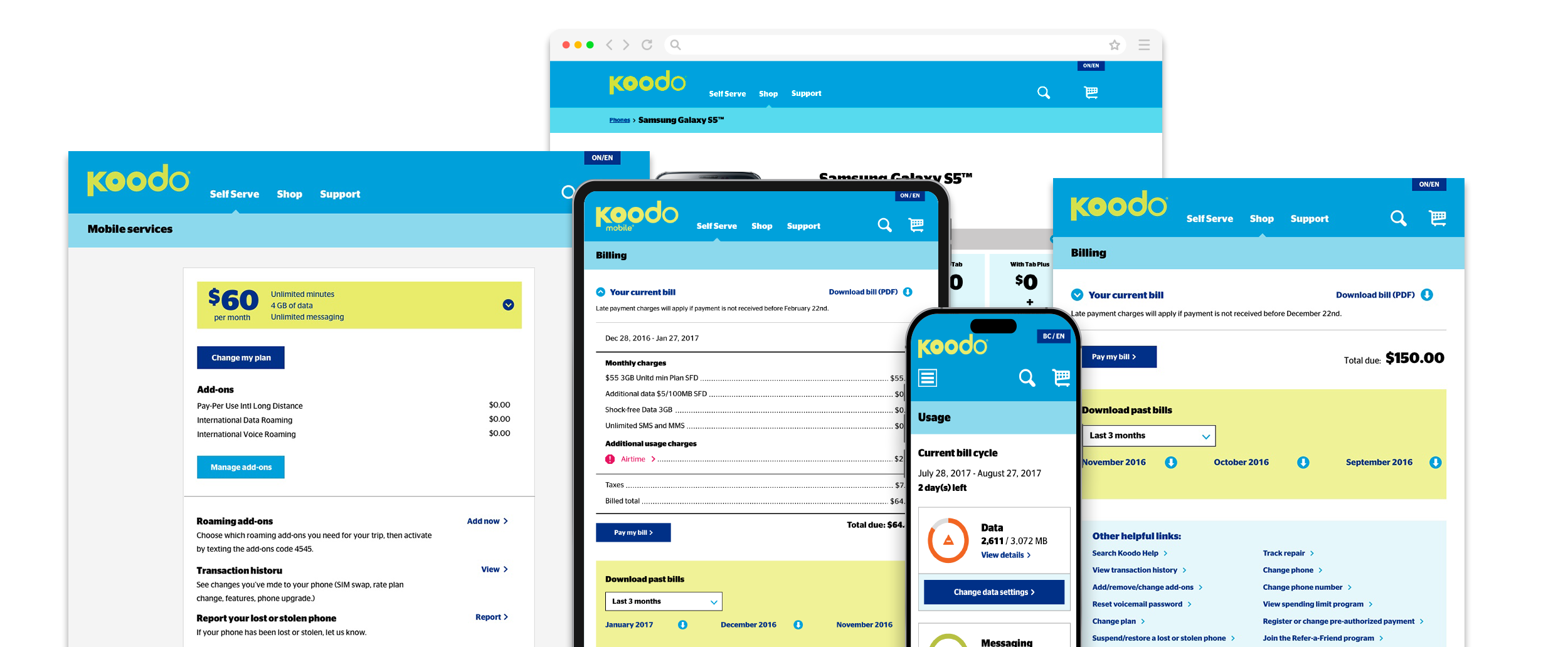
Koodo Mobile Case Study

Koodo’s self-serve platform was a critical touchpoint for customers managing their mobile services. The goal was to increase digital adoption and reduce call center volume by empowering users to complete high-frequency tasks independently.

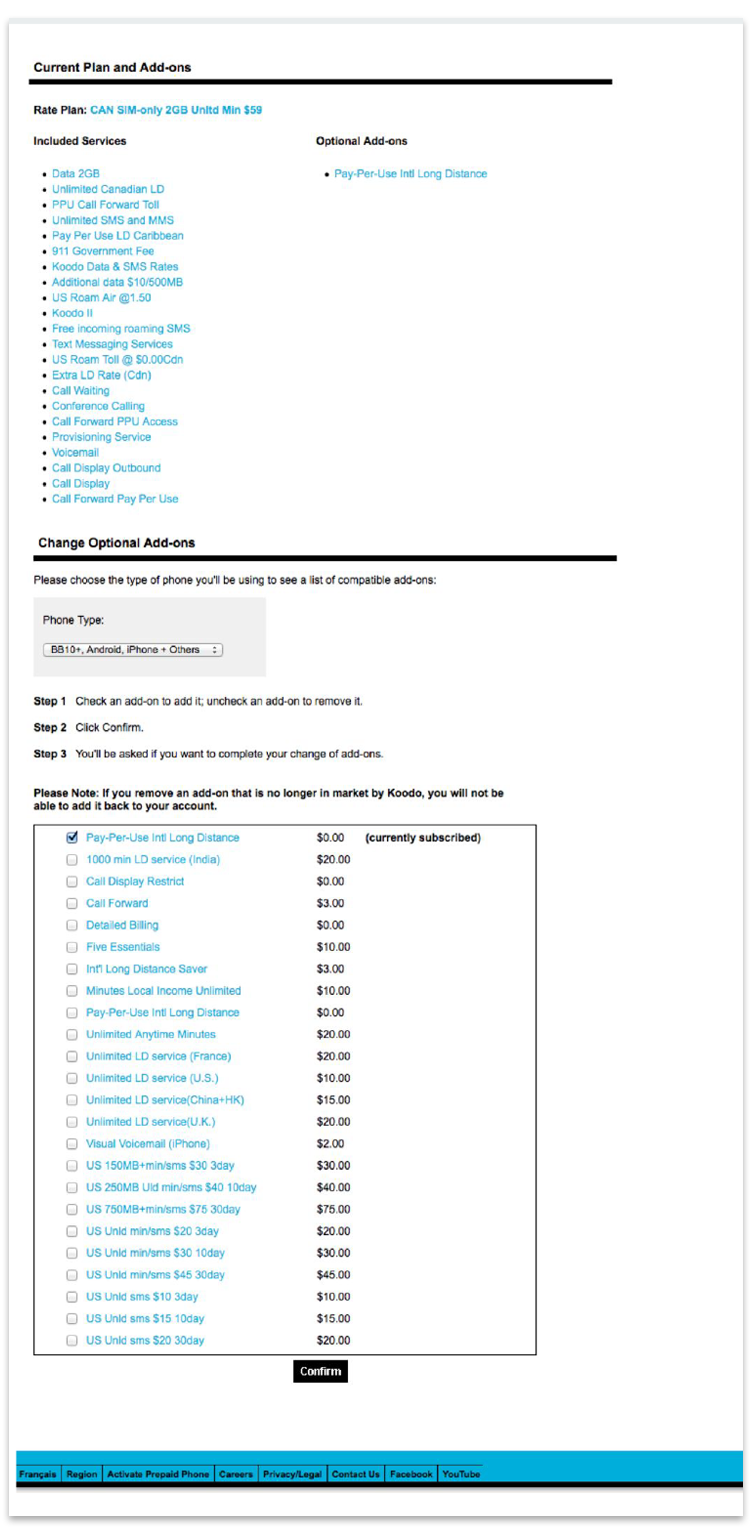
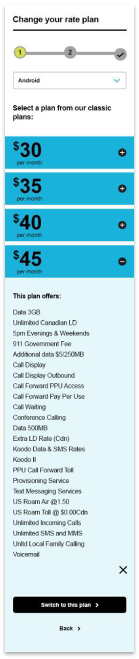
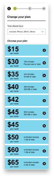
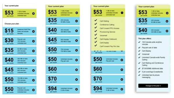
Key self-serve features included:

  • Viewing data usage
  • Changing rate plans
  • Paying bills
  • Purchasing add-ons
  • Phone upgrades
  • Parental controls

CLIENT
Sunlife

ROLE
As a Senior UX Designer:

  • Led end-to-end UX design across key flows
  • Conducted research and usability testing
  • Created wireframes and prototypes
  • Collaborated with stakeholders and engineering
  • Iterated based on user feedback and analytics

Problem

The business faced two major challenges:

  1. High call center dependency
    Many users relied on agents for tasks that could be done digitally.
  2. Low task completion & confusion in key flows
    • Users struggled to understand rate plans and billing
    • Registration drop-offs were high
    • Proration (billing changes) caused frustration and mistrust

Additionally, there was a business shift toward charging for assisted services, making intuitive self-serve flows essential.

Goals

  • Increase self-serve adoption and task completion
  • Reduce call center volume
  • Improve clarity of complex concepts (e.g., proration)
  • Enable business flexibility (e.g., launching promo plans digitally)

Approach

1. Rate Plan Change Experience

Problem
  • Users couldn’t recall their current plan
  • Too many plan details created cognitive overload
  • Users struggled to compare plans effectively

I worked closely with:

  • Product & business stakeholders
  • Customer service representatives
  • Users through testing and validation
Methods
  • Analytics review (feature usage, drop-offs)
  • Usability testing (moderated + guerrilla)
  • Iterative prototyping
  • VOC (Voice of Customer) insights
  • Collaboration with call center reps for real-world pain points

Iteration Breakdown

Iteration 1 — “Show Everything”

We started with a comprehensive list of plan details.

It looked complete. It felt thorough.

But in testing, users were overwhelmed.

  • They didn’t recognize their current plan
  • They ignored most of the details
  • They couldn’t confidently choose

We learned: More information ≠ better decisions

Iteration 2 — “Simplify”

We stripped it back to what mattered:

  • Price
  • Data
  • Minutes
  • SMS

Users moved faster.

But something was still missing.

They were scanning—but not truly understanding.

The Breakthrough — “Compare Against Yourself”

We introduced a sticky view of the user’s current plan, always visible as they browsed options.

Now, instead of evaluating plans in isolation, users could answer a simple question:

Is this better than what I have now?

That shift changed everything.

Result:

  • Faster decision-making
  • Increased conversion on plan changes

Insight

Users don’t compare abstract options—they compare against what they already have.