Sun Life Financial was awarded the Canadian Dental Care Plan (CDCP), an initiative supporting over 3 million Canadians in accessing dental care.
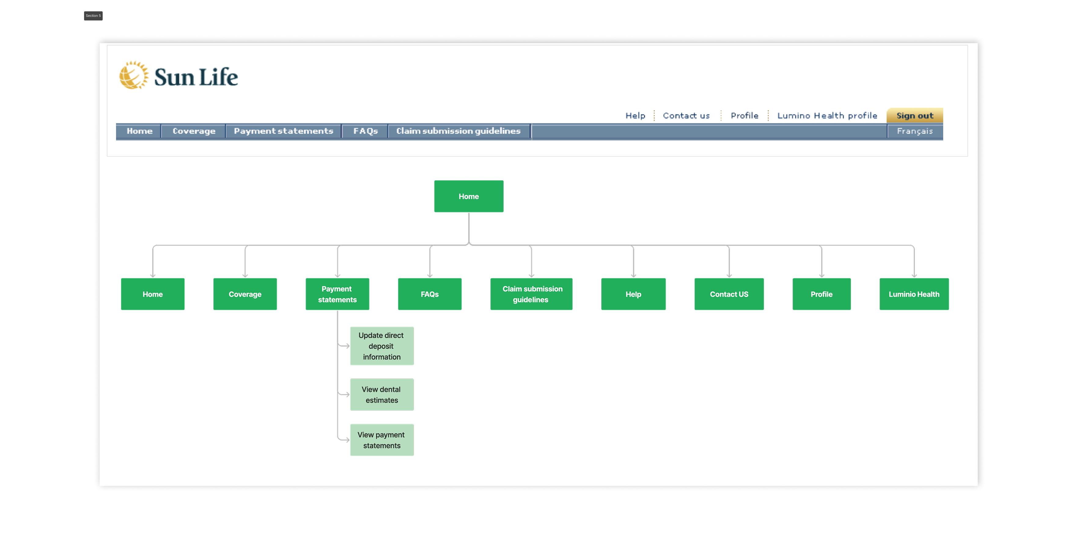
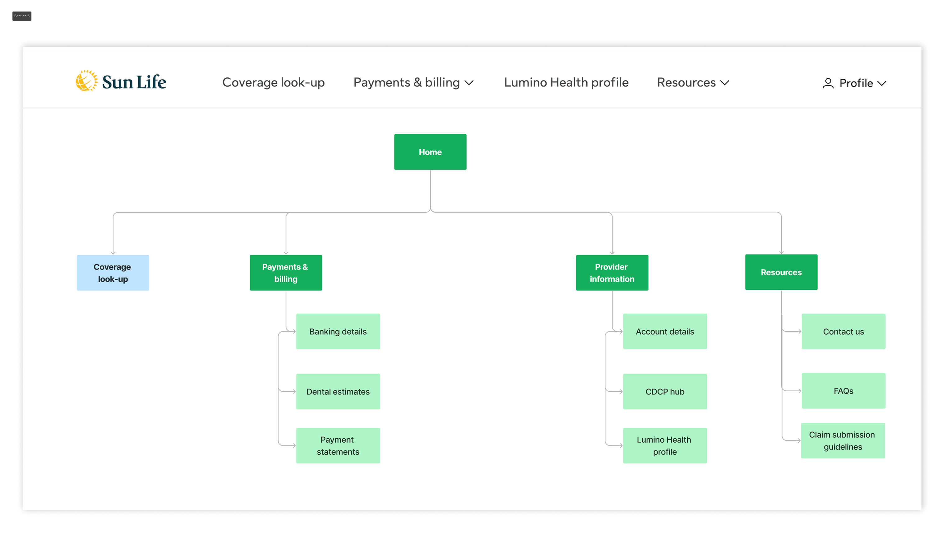
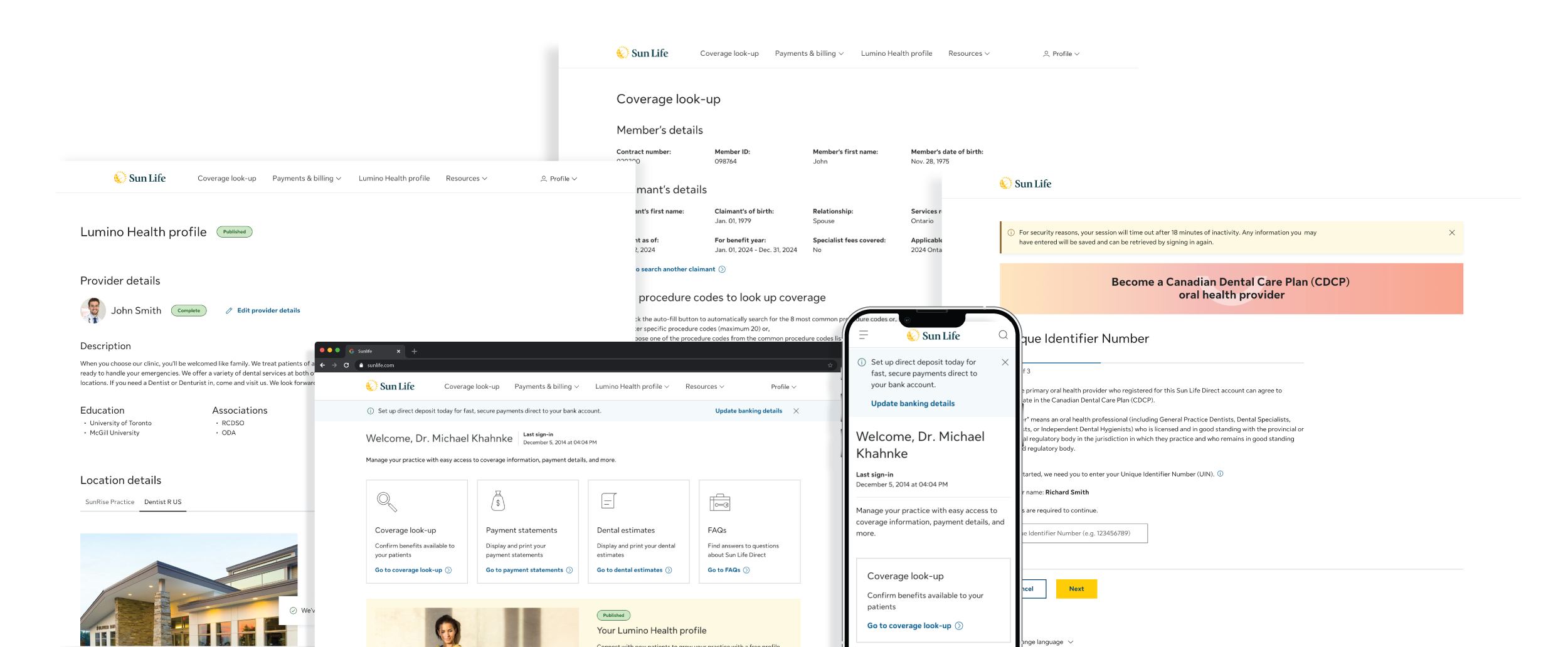
To support this rollout, we redesigned the provider platform—enabling healthcare professionals to efficiently manage enrolment, claims, eligibility checks, and program updates.
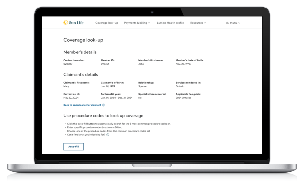
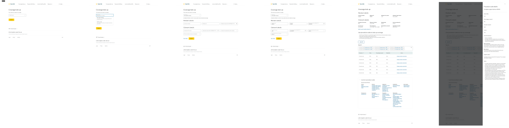
Key self-serve features included:
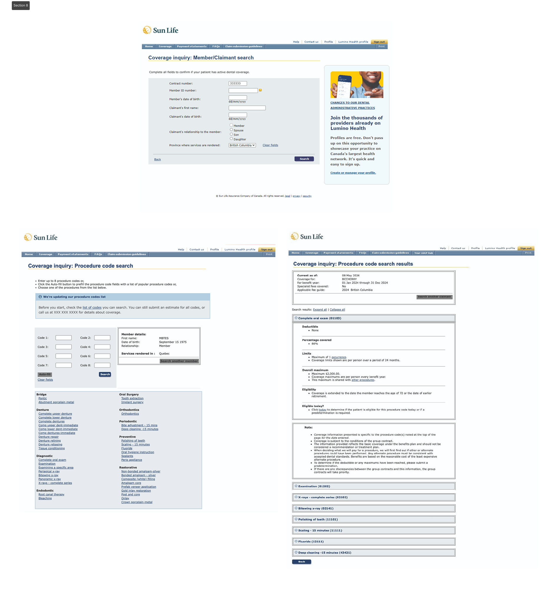
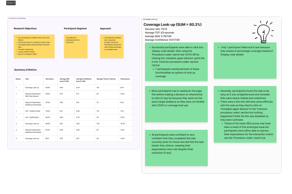
- Coverage look-up
- CDCP registration
- Claim submission tool
- Lumino Health
- Menu (Navigation)