CIBC Case Study

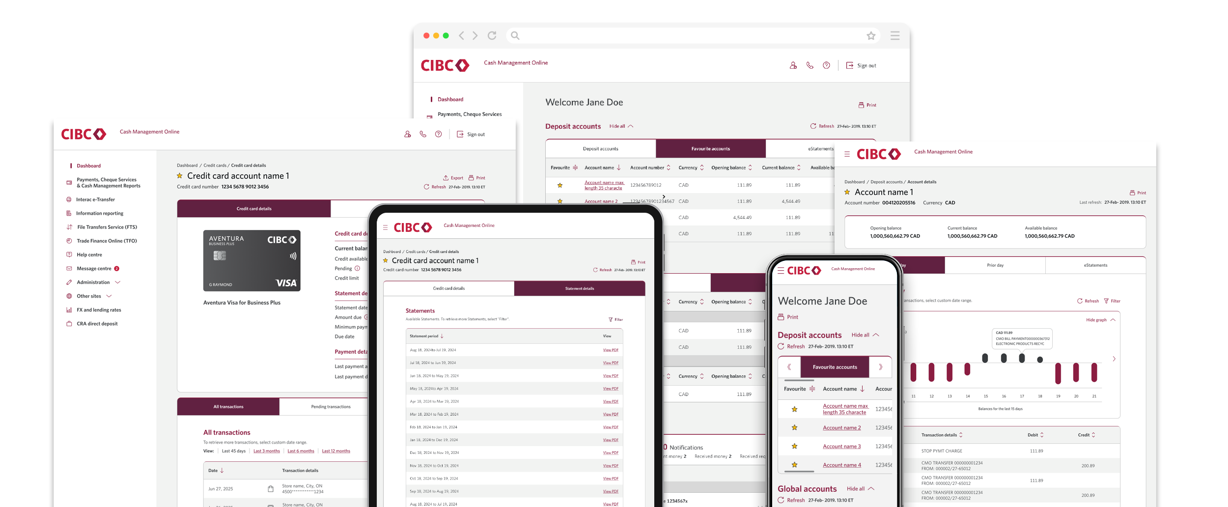
At CIBC, I led UX design for the Business Banking portal redesign, delivering a modern, accessible, and responsive experience for a large and complex financial ecosystem.

This initiative was executed within a waterfall delivery model, requiring upfront alignment across business, technology, and design before development began. The redesign leveraged existing design systems and backend services, while introducing new service integrations to expand functionality.

Key self-serve features included:
  • Credit Cards
  • Deposit accounts
  • Global account
  • Lending account
  • Interact eTransfer
  • Global accounts

CLIENT
CIBC

ROLE
Senior UX Designer

  • Led end-to-end UX strategy and execution
  • Facilitated alignment between business, product, and engineering
  • Defined experience architecture across key features
  • Conducted usability testing and validation
  • Ensured accessibility and responsive standards were met

The Challenge

The existing portal had grown fragmented over time:

  • Inconsistent UI patterns across features
  • Accessibility gaps below AAA compliance
  • A dashboard that prioritized visuals over usability
  • Low engagement with key features like the Message Centre

At the same time, we needed to:

  • Maintain system stability (legacy constraints)
  • Reuse existing components where possible
  • Integrate new backend service calls without disrupting workflows

Goals

  • Deliver a modernized visual experience
  • Achieve WCAG AAA accessibility compliance
  • Create a fully responsive design system
  • Improve task efficiency and discoverability
  • Expand capabilities (e.g., Credit Card management)

Process

1. Discovery & Evaluation

We began by auditing the existing experience:

  • Heuristic evaluation of core flows
  • Accessibility gap analysis (against AAA standards)
  • Review of analytics and feature usage
  • Stakeholder interviews

Key Insight:
Users didn’t want more data—they wanted clarity and control.


2. User Feedback & Testing

We validated assumptions through testing:

  • Users struggled with information hierarchy
  • The dashboard graph dominated attention but lacked utility
  • The Message Centre had low engagement
  • Users wanted a quick snapshot of all accounts

3. Constraints & System Design

Operating in a waterfall model meant:

  • We mapped backend service responses early
  • Designed within existing component frameworks
  • Identified where new service calls were required

Key Design Improvements

Dashboard Redesign

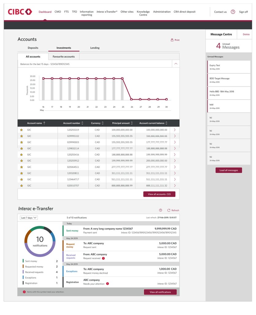
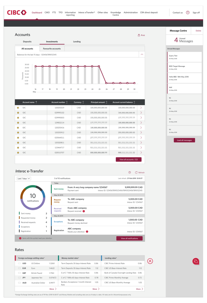
Current design

Problem:

  • Overly dominant graph
  • Poor information hierarchy
  • Low-value Message Centre placement
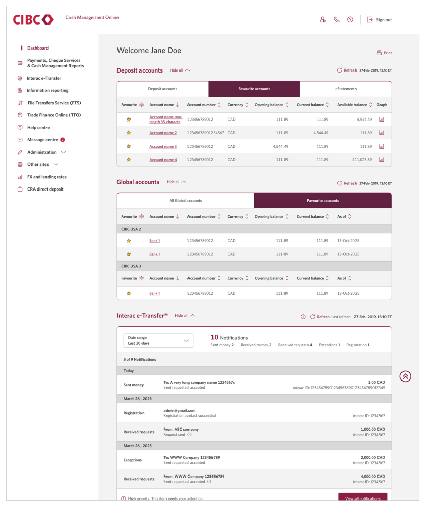
New design

Solution:

  • Introduced a high-level account snapshot view
  • Prioritized quick scanning and task entry points
  • Reduced emphasis on non-essential visuals
  • Repositioned Message Centre based on usage insights

Impact:

  • Faster access to key account information
  • Improved usability across devices
  • Reduced cognitive load

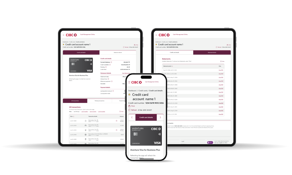
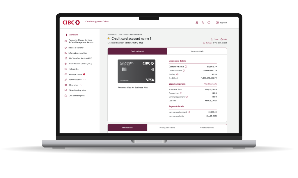
Credit Card Redesign

Problem:
Credit card functionality did not exist in the portal, creating fragmentation across channels.

Approach:

  • Conducted backend capability inventory
  • Mapped available service responses
  • Balanced business requirements + user needs

Solution:

  • Designed a centralized credit card management experience
  • Enabled:
    • Transaction visibility
    • Balance tracking
    • Card-level controls
  • Ensured consistency with existing patterns